
If you have been on Facebook long enough, you are sure to have seen some bad ads on the platform. Some might make you cringe, others might make you scratch your head and there are a few that will just make you shake your head.
With so many businesses advertising on Facebook, there are bound to be some Facebook marketing fails. While you certainly would not want to dwell on the misfortune of others, these terrible Facebook ads can be worth your time. Many of them offer great examples of what not to do when you advertise on Facebook.
This post will cover some of the worst examples of Facebook advertising from the past year, 2020. We will take a look at what went wrong and provide pointers to help you avoid ending up on one of these lists. We’ll also walk through some general steps to making your ads more dynamic.
Making Your Customers Feel Bad
Source: https://www.adquadrant.com/blog/10-hilariously-bad-facebook-ads
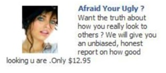
The ad above asks users if they are afraid of being ugly. The ad fails because – aside from the obvious spelling mistake – it will make many in the target audience feel bad and insecure. Positive emotion is a better way to inspire action. Not to mention there are some serious issues with the wording.
Using pain points can be a good way to get customers to click on your ad, but it shouldn’t be something that hurts their feelings. You introduce a problem and provide a solution. The product seems a little sketchy to begin with, but they still could have taken a positive approach. Instead of the headline focusing on how ugly the user might be, you turn it around and make it about beauty.
Offending the Public
Source: http://marqueex.com/worst-ads-of-2020/
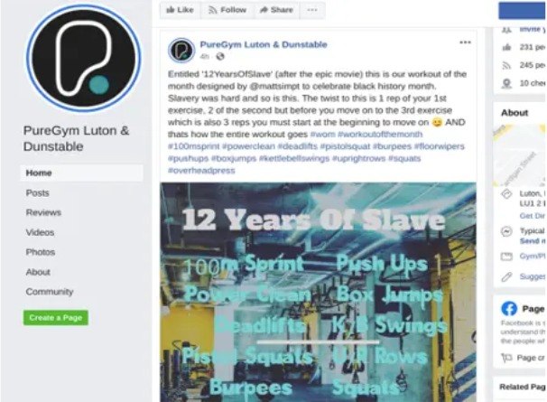
This one is a post and not an ad, but it offers a great example of what not to do with your Facebook marketing. PureGym shared a post to mark Black History Month with a “12 Years of Slave Workout”. You can already imagine how this would not go over well, but it gets worse when they compare the difficulty of the workout to slavery.
As bad as the post is, there are some good ideas behind something that was executed horribly. To start, they are trying to use a seasonal event in the marketing. That can often be a good idea. They also tried to link the ad to something in pop culture, which can also work well.
The problem is the content. Even with the best of intentions, the ad comes across as insensitive and trying to use one of the horrors of history for marketing is almost certain to fail. The best way to avoid this type of mistake is to have a review process for every post. One person might not see the problem with a post that could be offensive to many, but a review process will probably catch the issue. Getting a second person to review the content probably would have prevented this post from going live.
Missed Language Targeting

source: https://www.adquadrant.com/blog/10-hilariously-bad-facebook-ads
This ad is in Japanese but it is being shown to people that do not speak the language. The advertiser probably picked a targeting option that included people from outside of Japan. Regardless of the language your ads are in, it is a waste to have them appear before users that do not speak the language.
To avoid this issue, you just need to refine your targeting. If you are targeting based on interests, pages or some other broad category that could cover people outside the language group you are covering, you need to make sure to apply language-based targeting.
A Little Too Random
Source: https://blog.imageinabox.com/6-of-the-best-and-worst-marketing-campaigns-of-2020
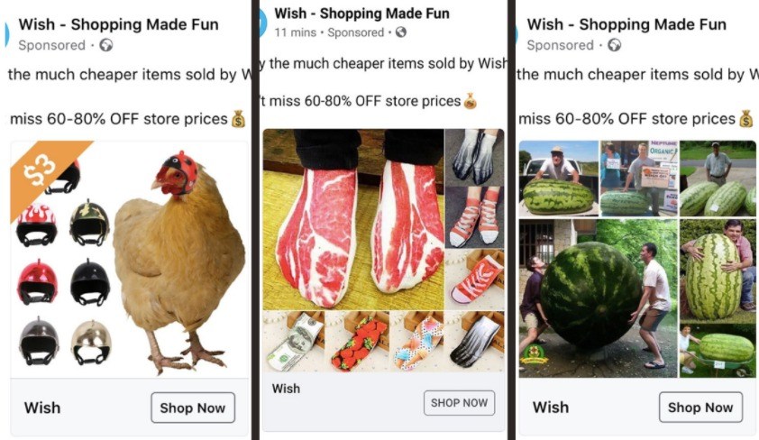
The online shopping platform Wish prides itself on having an insanely wide variety of products for very low prices. These ads show just how strange some of those products can be. The problem with these ads is that they are sending people ads featuring products that are just random and without consideration of whether the user might have any interest. Sure, some people will click because the products are so weird, but most of them won’t buy.
Being random, the ads waste money. You want to develop different audience segments and send them ads that feature products they might be interested in. The key to avoiding this mistake is to develop different target audiences and figure out what those audiences want from your business. It takes time and effort, but it is worth doing.
You can learn a lot from the best Facebook ads, but the lessons from bad ads are often more important. At best, bad ads are a waste of money and at worst, they can damage your reputation.
There are other Facebook ad mistakes that may not be as obviously offensive but can still have a negative effect on lead generation.
Not Having a CTA
Every Facebook ad has a goal of conversions.
Whether that’s measured in engagement (i.e. likes), app downloads, or purchases, a successful advertisement includes a clear CTA and callout within its copy.
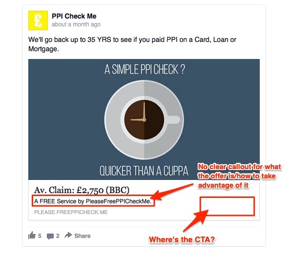
PPI Check Me missed the mark with their Facebook ad, which has no discernible CTA at all.
The only option in this example appears to be to follow the link that is listed in a light (indiscernible, in our opinion) grey below the ad copy.
When you launch your strategy, be sure your copy directs users to a clear call-to-action.
Include the CTA button directly within the ad, and use your text to include a callout of the product or service that will compel people to convert.
Failure to Hook the Customer
There are certain psychological principles that govern the success of a Facebook ad.
Color psychology is one such example.
You can use color to elicit certain emotions, grab visitor attention, and more.
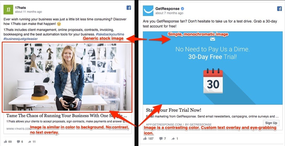
Check out this comparison.
On the left, 17hats shows what happens when design misses the mark.
Despite using compelling copy, the ad fails to compel users to even click through because of its monochromatic appearance and generic stock image.
The fact is, 85% of people will make a purchase decision based primarily on color.
You need to draw people in that are both aware of your brand and those that are not with bright and bold graphics.
Try using this ad color guide from Wishpond and A/B testing what works best for your brand’s Facebook ad strategy.
Always, though, include an eye-catching, colorful image that gets the attention of both new and current customers.
Not Adding Any Value
Before someone will take action on a Facebook ad, they need to feel that doing so will provide some kind of benefit to them.
The value can be tangible, like a promotion offering a coupon code of 25% off.
It can also come from solving a customer problem or pain point.
However you build value, make it explicit when launching your Facebook ad strategy.
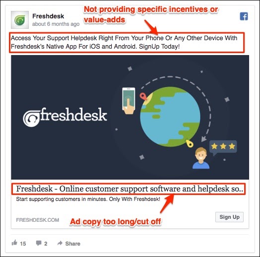
Freshdesk gets close to providing that value with their visual and copy that emphasizes the software’s convenience.
The questions you need to answer in your Facebook ad strategy are: Why should someone be interested in your offer and what even is your offer?
Connect the dots for your customers in the headline, sub-headline, and caption so they know the value.
Having Too Much Text
Good Facebook ad copy should be short and sweet.
And this applies to not only the headline and link description, but to the text on your ad image, too.
Facebook prefers ads that have little-to-no image text.
Once you start adding more, there is a risk your ad will get shown to fewer audiences.
And that’s exactly what happened with this next ad.
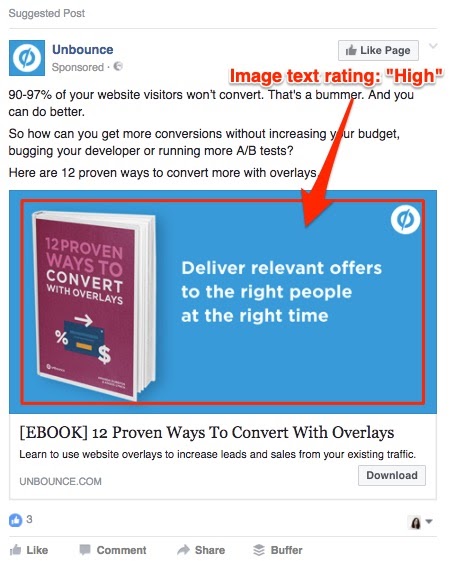
Unbounce is the unfortunate ad example of choice here.
Their ad doesn’t necessarily seem like it belongs among the cringiest Facebook posts at first glance.
But, Facebook rated their image:text ratio as too high.
Why is that?
Well, their ad image is essentially all text on a monochromatic background.
The one image present – the book – also contains text.
So how can you avoid landing on a list of the worst internet ads for a mistake like this?
Facebook has a handy tool that checks the amount of text in your ad and rates it on a scale from low to high.
This can help you see if your ad will reach too few people, and adjust it if that’s the issue.
Visuals Gone Awry
Any successful Facebook ad strategy incorporates a graphic (i.e. video, static image, carousel) that grabs the user’s attention. Besides being eye-catching, the visual should also relate to the brand or promotion.
This probably isn’t news to you.
However, we’re emphasizing it because the image really is that important. One of the worst things you can do is create a Facebook ad that has a blurry, indecipherable, or messed up image.
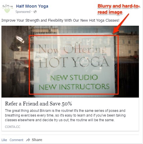
The blurry image is difficult to read and fails to catch the viewer’s attention thanks to its transparent filter and lack of color.
Both of these qualities make the image itself entirely ineffective while taking attention away from the goal of the advertisement as a whole.
Don’t fall into the trap of a poorly-conceived ad image.
Instead, include a visual aid that supports the objective of your Facebook ad strategy.
Additionally, make sure it is a high-quality image devoid of too many additional details, like this rainy photo.
