
Designing a lead generation landing page isn’t just about adding a lead form and directing traffic. If your goal is to get really high conversion rates, it’ll take you some time and effort. Let’s look at 15 examples, which will show you what methods are extremely effective.
1. Right Signature
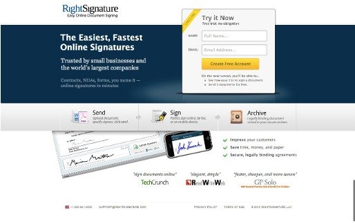
A headline is the first thing that captures your attention. This example represents the idea of how gripping headlines should be written. It’s a simple and clear description of how the product works.
Secondly, there is a fine lead form, which is located in the right place, at the top of the page. In addition, it stands out thanks to the use of the encapsulation method. The element is placed in a certain graphic module that stands out sharply against the background of the page due to color contrast and pseudo-3D effect. The form will always be above the fold, so you won’t need to scroll the page.
Then, you see a piece of additional information near the CTA button. It allows you to know what you’ll get after clicking. Besides, the additional mention of the free benefit is also a good incentive to build the lead generation.
A simple demonstration of functions contributes to the visual constituent of the landing page. There is a clear 3-step description that allows you to understand how to use the product.
2. OCD – Clinical Trials
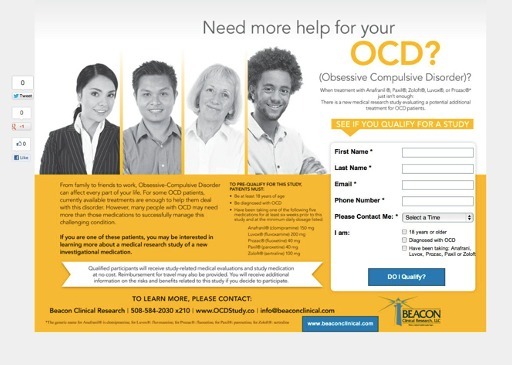
To begin with, the first thing that you see is a question in the CTA area. Actually, questions, in this case, are a very powerful tool for influencing the human psyche. It, in turn, contributes to the completion of the conversion. They ask you something, and you fill in a lead form in search of an answer.
Then, a photo of good-looking and friendly people of different age, ethnic and gender groups. It gives a sense of serenity. So, it assures that obsessive-compulsive disorder doesn’t mean something wrong and weird. On the contrary, it shows that this is a very common problem in the modern world, which can affect everyone.
3. Empires & Allies
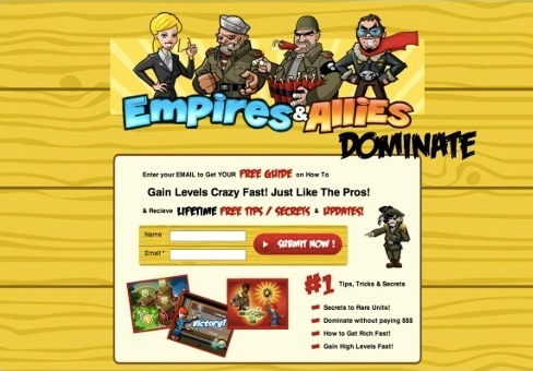
In this example, you can see many benefits providing you fill in the form. They are listed as the following:
- Fast hero leveling;
- Free hints and hacks;
- Updates and workaround.
Besides, there is a short lead form that asks you the most basic information, but still, it’s effective. The attractive design matches the aesthetic preferences of the target audience.
4. Azure Luxury Malta
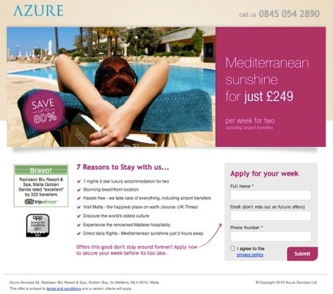
On this landing page, you can observe an extremely high-quality headline combined with the value proposition “You can profit from the Mediterranean sun!”. Moreover, the intriguing choice of words of the offer instantly involves you in the conversion process.
It’s not that easy to pick up the semantically relevant words that would match your business. You can use special SEO services. Look at the SEO calculator example, where you can instantly see the price of your order.
Besides, the great main image emphasizes the meaning of the core sentence. After reviewing the list of benefits highlighted by bullets, your gaze moves down right to the lead form. It’s a perfect trick!
5. Learn French
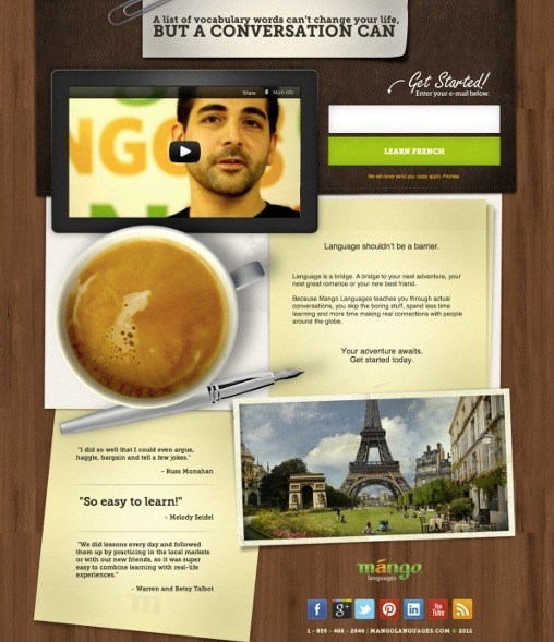
Another example shows an efficient landing page composition. Users see a touching and emotional video dwelling upon the reason for the founding of the company. This helps to get a pretty high degree of your involvement in the conversion process.
There are a few guiding signals. The fountain pen’s tip acts as a pointing arrow, directing the user’s gaze into the conversion zone. Also, the video ends with a friendly request to register for this language course.
By the way, you can see the most simple call to action. Learn French!
6. iPhone App Development
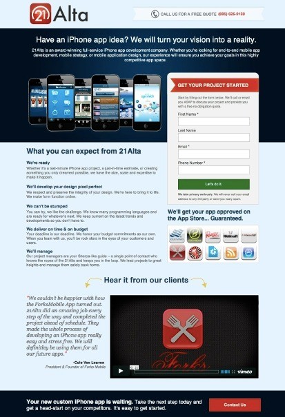
There, you can observe a clear and compelling headline. It’s clear that you’re dealing with developers of applications for iPhone smartphones. Besides, the wording which goes “We will bring your ideas to life!” instills in the visitor a sense of confidence that greatly promotes conversion.
Moreover, the highly targeted lead form headline says, “Start Your Project!”. It, in its turn, encourages the user to fill in the form and begin their journey.
What is more, you can watch video feedback from a client. Those advertising words addressed to you sound much more convincing when a demo video accompanies them. It shows the visitor the work quality.
To continue, there is a persuasive statement telling about benefits. All of them are placed in the center of the page directly under the heading. It increases the level of brand credibility.
Ultimately, you get a guarantee. Offering a guarantee is always the best way to convince the users that they can trust and cooperate with you.
7. Cookie Dough Fundraising
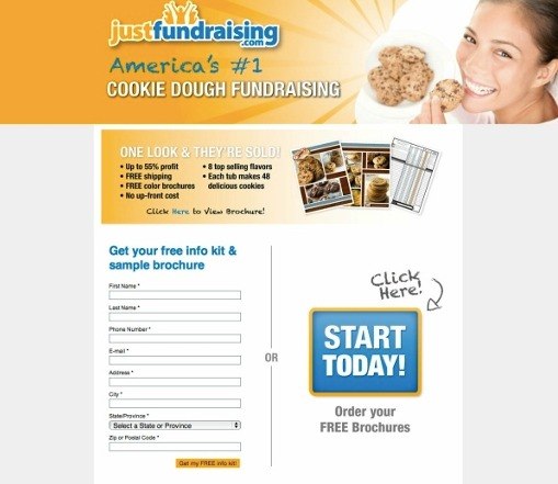
There is a headline that emphasizes the company’s status “America”s No. 1”. Also, you can see mouth-watering banner pictures. These photos are perfect proof that their product is simply delicious.
8. Hillbrush Food Safety
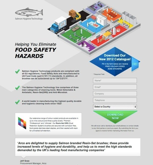
The page design is made with emphatically highlighted corners of figures that make a visitor follow the page. It draws your attention to the conversion area.
9. Fast Track Sales
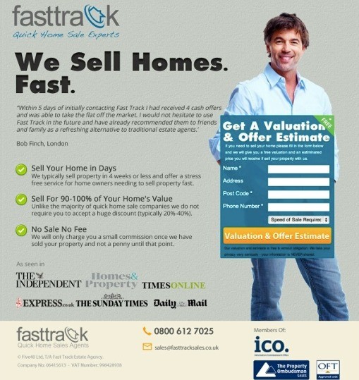
A persuasive title on the page explains the value of the offer in an instance. The company sells houses like hotcakes. It’s a great title.
Besides, there is a powerful social proof. Logo set adds credibility to the claim that the campaign has a well-deserved reputation among the competitors. Thу form is highlighted by adding contrast, which helps it to stand out.
10. Villa Huinid Cabanas
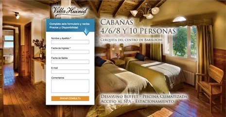
A capturing background of the page precisely shows you the interior, where you can spend your vacation. The site’s owner hints you to fill out the form by adding an arrow. Everything is quite simple. If you want to be in this gorgeous picture, you won’t hesitate to fill out a lead form!
11. Voxeo
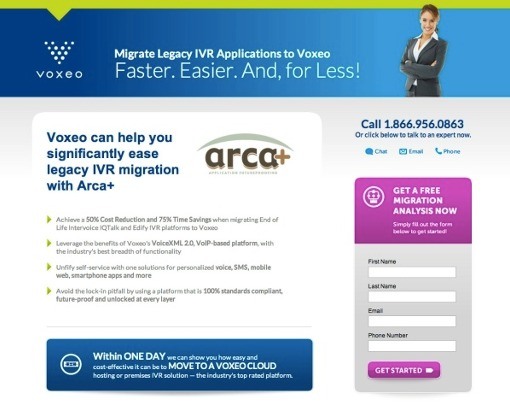
There are alternative options for communication with the sales department:
- E-mail;
- Chat;
- Phone.
Moreover, you can notice a gorgeous contrasting CTA area. The luxurious shade of purple stands out beautifully.
12. Speedy Limousines
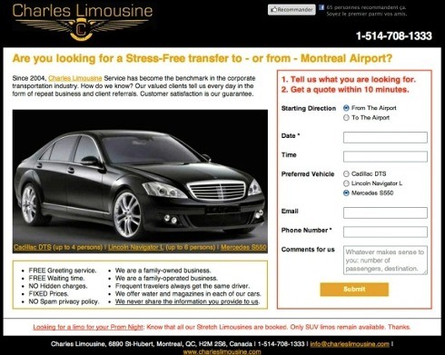
The title brilliantly explains the offer, giving a simple solution. The lead form distinguishes as well. It’s the red border that catches your attention and encourages you to fill in that form. There is a promise to respond within 10 minutes, which increases your engagement in conversion.
13. Drug & Alcohol Counselling
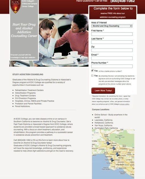
The main image evokes an emotional response from visitors. Besides, a map that shows the closest clinics to your location is actually very useful.
14. Optimize New York
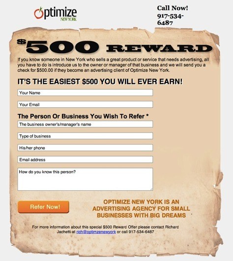
In this design example, you can observe quite compelling rewards. 1500 grabs your attention more than any other headline. It’s a gift to someone who provides the coordinates and contact details of a New York small business (restaurant, bar, clothing store) worthy of a landing page from your marketing agency.
To continue, each of us has a favorite restaurant, bar, or store. If you regularly visit a place, you’re probably ready to recommend it. So its owner receives the promised reward and gains more authority.
Also, there are contacts. To build confidence that you can actually receive the promised prize, the manager’s contact info is posted on the page.
15. Spanish Slang Dictionary
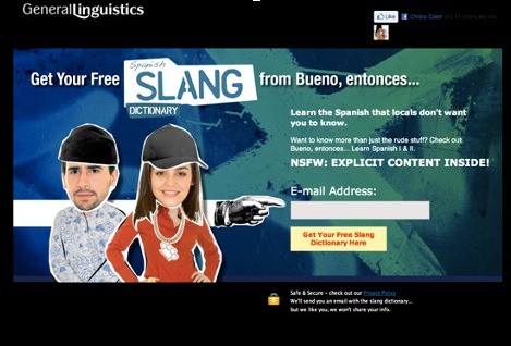
Involvement is achieved with entertainment. When you plan to visit a foreign country for a few days, you probably want to know its culture and language as well. This makes the trip more enjoyable.
A CTA area describes what you can get using the product. This is how you should do call-to-action elements on sites’ pages. Besides, you can notice the simplest possible form, consisting of one field – an email address. Though it’s nothing special, it’s still effective enough.
These examples show you how to create a page and make the most in terms of lead generation. Use the experience of your competitors and create even better site pages, or consider getting in touch with a landing page agency for even better results!
