What’s your landing page conversion rate? If you’re like most businesses, chances are you fall somewhere around the 3% mark.
But the truth is, that’s far from the ideal number. In fact, you could do two, even three times better by applying a few simple landing page hacks. And all that without having to make a dent in your budget to boost traffic to your website.
In this article, we’ll explore these hacks, presenting you with proven-to-work strategies that are guaranteed to positively impact your conversion rates and, consequently, the success of your business.
Adopt a User-Oriented Approach
The best thing you can do if you want to improve conversions on your landing pages is, without a doubt, to adopt a user-oriented approach.
In 2022, customers aren’t persuaded to convert by product prices or brand reputation. Instead, research shows almost 70% of them are actively looking to invest in products and services that deliver the most value.
Knowing this, you have to make sure that your landing pages communicate not only the quality of your products but also the exact ways in which your offer is relevant to your target audience.
Focus on the Benefits
To convince your target audience to convert on your landing pages, do your absolute best to describe the unique benefits your products offer.
Don’t go the standard route and get stuck on technical product features, even if they’re highly advanced and deliver results that none of your competitors can provide. Instead, try to show how your offer impacts your potential clients.
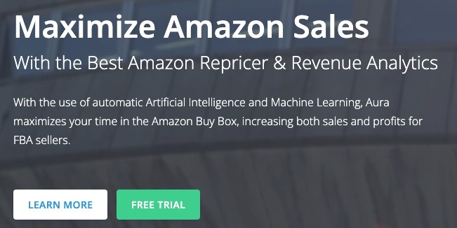
For a great example, check out how Aura does it in its unique value proposition. It could talk about AI and machine learning. But, instead of that, this brand underlines how it helps its clients maximize their time in the Amazon Buy Box, leading to increases in sales and profits.
Give Product Previews
Another fantastic way to maximize conversions on landing pages is to use them in a way that helps shorten the time it takes for potential buyers to move from one stage of the sales funnel to the next.
Essentially, when people land on your website, chances are, they’re still in the top stages of the funnel, simply exploring product options that would solve their pain points. But they’re not yet ready to buy.
However, if you convince them that your product delivers the results they’re after, you can speed up the conversion process and turn them into paying customers (or viable leads) before they start evaluating your competitors.
This is where product previews come in handy.
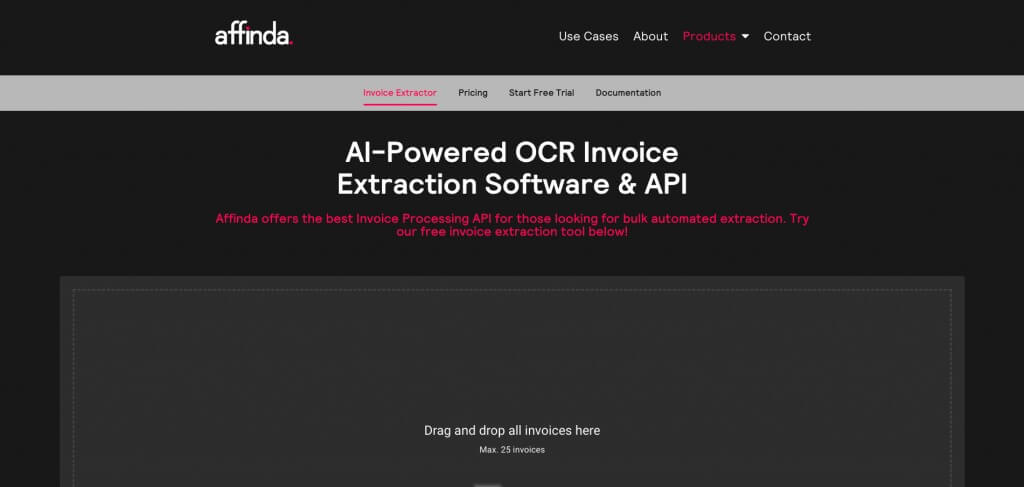
For example, the SaaS brand Affinda allows new users to collect data from up to 25 documents using its free invoice extractor product preview.
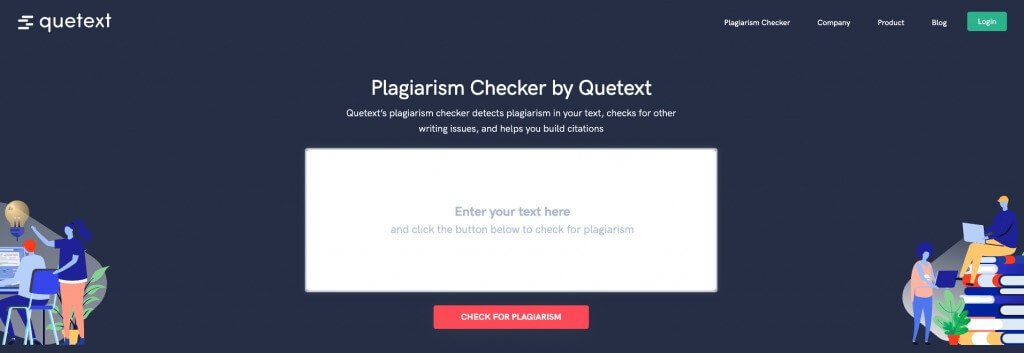
And Quetext does something similar while still taking steps to capture web users as potential leads. It gives full access to its plagiarism software to anyone who signs up for a free account.
Deliver Personalized Experiences
Data shows that, in 2022, consumers want brands to deliver personalization. In fact, it has been found that more than 70% of people expect companies to provide personalized experiences and get frustrated when that doesn’t happen.
Fortunately, adding a personal touch to your landing pages to boost conversions doesn’t have to be rocket science. You can easily do it with a few simple hacks.
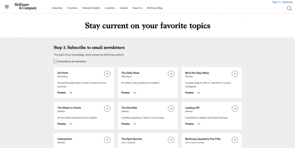
For example, McKinsey has an in-depth newsletter subscription section that allows new leads to fully personalize the emails they receive from the company. The offer includes daily, weekly, and monthly email subscription plans. And new subscribers can even indicate the topics they want to receive updates on, with the options including insights about Gen Z, diversity, leadership, management, etc.
Boost Readability Scores
One recent study from Unbounce discovered that website conversion rates went up when brands improved the readability scores on their landing pages.
So, if you want to do something that promises a positive impact on your CRs, it’s not a bad idea to take a close look at your copy and see where you can improve.
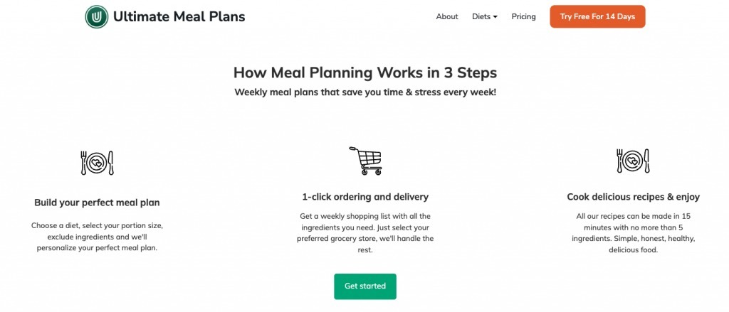
For example, one solution would be to shorten key paragraphs so that your web visitors can understand your products with ease. An excellent instance of this plan in action can be seen on the Ultimate Meal Plans homepage, where the How it works section describes the three steps of the meal planning process in less than 100 words.
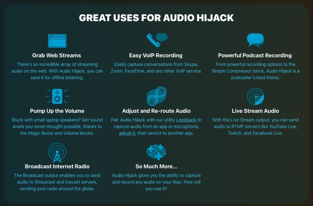
Alternatively, you could also employ visuals to boost readability.
The Audio Hijack product page, for example, utilizes easy-to-understand illustrations to describe the possible applications of the software, making it easier for web visitors to get an idea of what they can expect from the program.
Place Conversion-Driving Elements in the Right Spots
Did you know that looking at online user behavior to make design choices for your landing pages holds the key to improving conversion rates on your site?
That’s right. Simply knowing how users interact with pages gives you valuable insights you can use to place your conversion-driving elements in the right spots.
For example, one study from Nielsen found that people spend considerably more time above the scroll line on landing pages than in any other section.
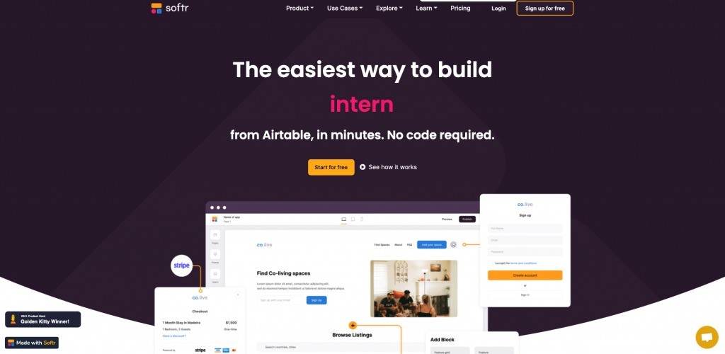
So, it’s only natural that you should place your unique value proposition and most valuable CTAs in the hero section of your site, just like Softr did in the example below.
As for more recent online user behavior data, the latest report from Vidyard discovered that 70% of marketers stated that video converts better than any other content format.
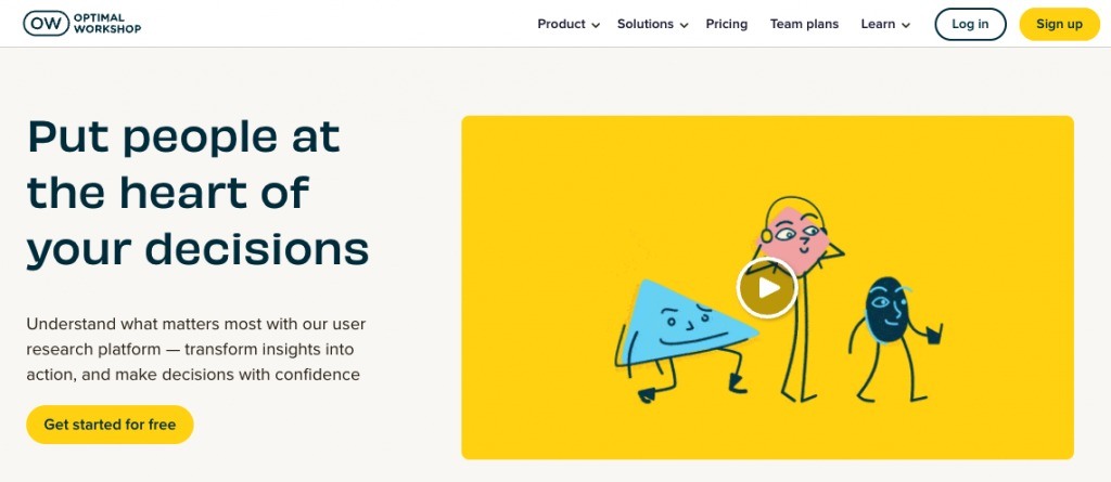
So, if you can, try to add an explainer video to the hero section of your landing pages, as done by Optimal Workshop. This will not only help your web visitors get informed about your products but also allow you to communicate user benefits more effectively, consequently boosting conversion rates and securing more leads for your business.
Make the Conversion Process Less Cumbersome (and Intrusive)
Research shows that the best way to get web visitors to convert on landing pages is to make the entire process as seamless as possible.
And this doesn’t just mean placing your conversion-driving elements in highly visible places and avoiding redirects. It also means optimizing the entire conversion process to be quick and user-friendly.
For example, research from Hubspot found that reducing the number of form fields impacted conversion rates, with the optimal number being two or three.
Similarly, the Baymard Institute found that 17% of consumers who abandon their carts do so because the checkout process is too long or complicated.
So, if your goal is to enhance your landing pages, consider asking fewer questions and making the process of becoming a subscriber/customer as easy as possible.
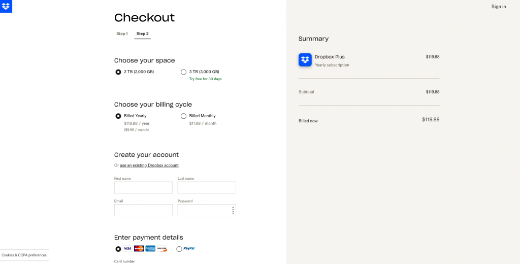
For inspiration, you can check out Dropbox, where the entire checkout process takes place on a single page, making it super-easy for new customers to get their subscription without becoming overwhelmed by the lengthiness of the process.
Minimize Risk
Finally, as you look for hacks to boost conversion rates on landing pages, don’t forget that getting people to become your customers depends on your capability to convince them that your brand is dependable and capable of delivering on its promises.
So, try to include as many trust-driving elements on your website as possible.
For one, you could do this with social proof. Whether you display testimonials, ratings, customer stories, or case studies, you can rest assured that the effort will pay off.
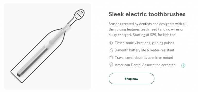
An alternative would be to experiment with trust signals on your landing pages. Brands like Quip have perfected the use of trust badges, with illustrations showing that the products deliver great user benefits, are multi-purpose, and meet industry standards.
Lastly, if you’re 100% devoted to putting in the work to optimize your landing pages for conversions, don’t forget about the fact that educational content works marvelously to get new leads.
Data shows that reading educational content makes users 131% more likely to convert. Plus, investing in these resources also gives you a unique chance to position your products as solutions to customer pain points without coming off as too sales-y.
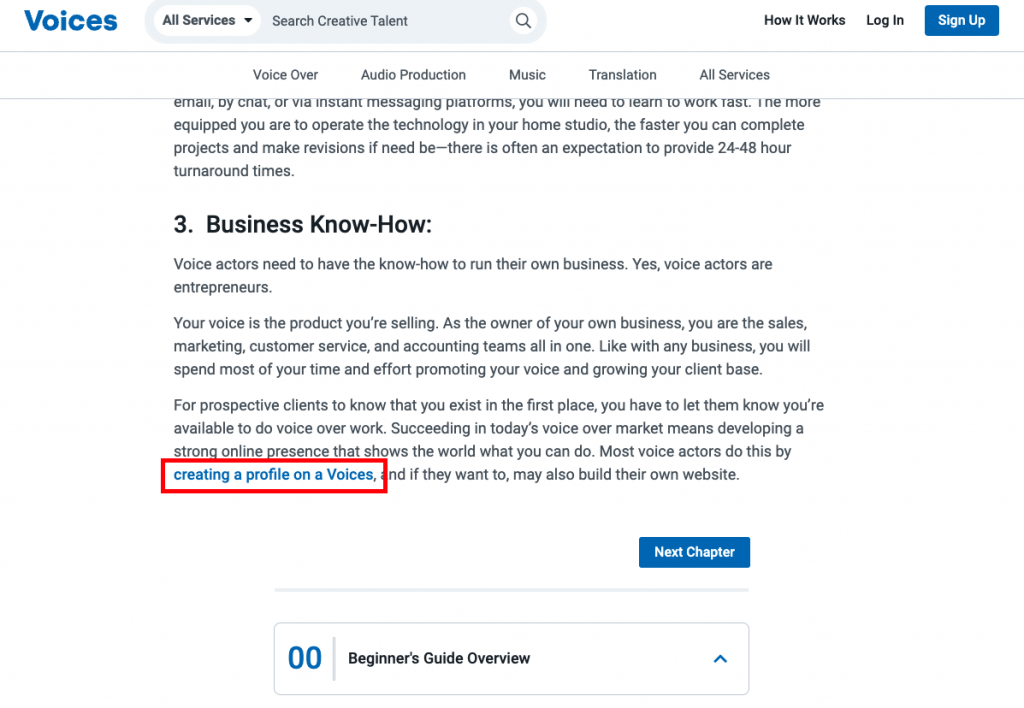
Just check out how subtly Voices does it in their Beginner’s Guide to Voice Acting post. The brand is encouraging readers to sign up for the service, all the while delivering a lot of value in an in-depth piece of educational writing.
Ensuring Conversion Success
As you can see, improving the conversion rates on your landing pages doesn’t have to be a highly technical process.
In fact, it can be as easy as optimizing your copy for readability, which is something you can do by running it through an app like Hemingway.
However, once you start implementing these hacks, don’t forget to continually test page performance to ensure you see improvements. Because, in the end, every website is different, and ensuring that your audience is finding value on your landing pages may require making a few unconventional tweaks. But they’re necessary to guarantee that consumers see you as an organization that can deliver precisely what they need.
Alternatively, leveraging the skills and experience of a qualified landing page agency can aide your efforts.


