
We’ve all seen them: The Facebook ad so bad, it brought tears to your eyes.
Sadly, this unfortunate occurrence is often more than once-in-a-lifetime.
There are more than 6 million businesses advertising on Facebook each month.
As you can imagine, this means there’s plenty of opportunity for the good, the bad, and the ugly of Facebook ad examples.
Instead of pitying the poor digital marketers that run such cringy Facebook posts, use them as examples of how to improve your own ad strategy.
We’ll show examples of what the worst ads of 2019 look like (prepare the tissues).
We’ll also tell you exactly where they went wrong and provide tips for how to advertise on Facebook the right way.
With an average conversion rate of over 9% across industries, it’s no surprise every social media marketer is trying to get a slice of the Facebook ad pie.
Here’s how to achieve conversions and boost your bottom line by learning from the worst internet ad examples of 2019.
Exhibit A: The Worst Ads on Facebook Don’t Have a CTA
Every Facebook ad has a goal of conversions.
Whether that’s measured in engagement (i.e. likes), app downloads, or purchases, a successful advertisement includes a clear CTA and callout within its copy.
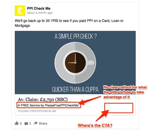
PPI Check Me missed the mark with their Facebook ad, which has no discernible CTA at all.
The only option in this example appears to be to follow the link that is listed in a light (indiscernible, in our opinion) grey below the ad copy.
When you launch your strategy, be sure your copy directs users to a clear call-to-action.
Include the CTA button directly within the ad, and use your text to include a callout of the product or service that will compel people to convert.
Exhibit B: Failure to Hook the Customer
There are certain psychological principles that govern the success of a Facebook ad.
Color psychology is one such example.
You can use color to elicit certain emotions, grab visitor attention, and more.
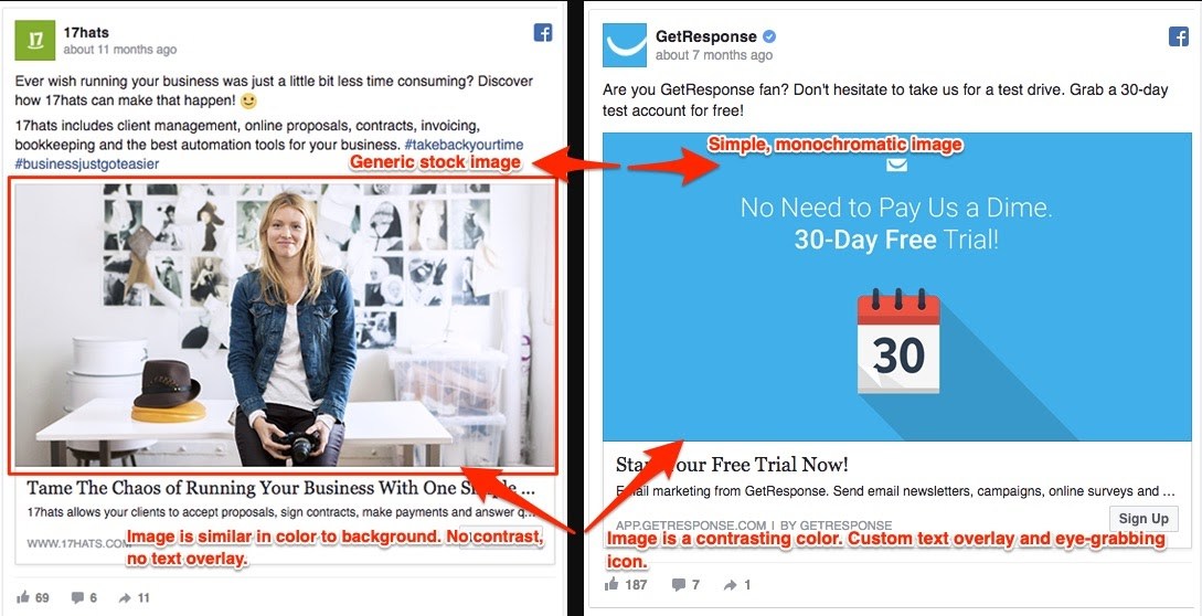
Check out this comparison.
On the left, 17hats shows what happens when design misses the mark with this example of one of the worst ads of 2019.
Despite using compelling copy, the ad fails to compel users to even click through because of its monochromatic appearance and generic stock image.
The fact is, 85% of people will make a purchase decision based primarily on color.
You need to draw people in that are both aware of your brand and those that are not with bright and bold graphics.
Try using this ad color guide from Wishpond and A/B testing what works best for your brand’s Facebook ad strategy.
Always, though, include an eye-catching, colorful image that gets the attention of both new and current customers.
Exhibit C: The Worst Advertisements Ever Fail to Build Value
Before someone will take action on a Facebook ad, they need to feel that doing so will provide some kind of benefit to them.
The value can be tangible, like a promotion offering a coupon code of 25% off.
It can also come from solving a customer problem or pain point.
However you build value, make it explicit when launching your Facebook ad strategy.
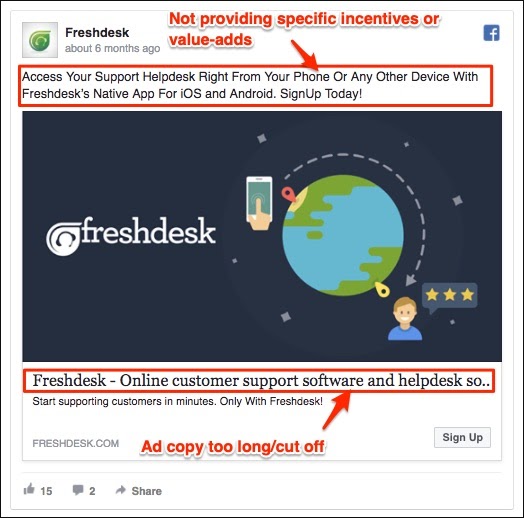
Freshdesk gets close to providing that value with their visual and copy that emphasizes the software’s convenience.
It’s clear that their software is for customer support, but they are in this list of the worst ads of 2019 because they fail to explain what the offer even is.
The questions you need to answer in your Facebook ad strategy are: Why should someone be interested in your offer and what even is your offer?
Connect the dots for your customers in the headline, sub-headline, and caption so they know the value.
Exhibit D: Your Facebook Ad Has Too Much Text
Good Facebook ad copy should be short and sweet.
And this applies to not only the headline and link description, but to the text on your ad image, too.
Facebook prefers ads that have little-to-no image text.
Once you start adding more, there is a risk your ad will get shown to fewer audiences.
And that’s exactly what happened with this next ad.
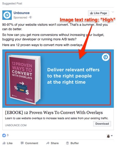
Unbounce is the unfortunate ad example of choice here.
Their ad doesn’t necessarily seem like it belongs among the cringiest Facebook posts at first glance.
But, Facebook rated their image:text ratio as too high.
Why is that?
Well, their ad image is essentially all text on a monochromatic background.
The one image present – the book – also contains text.
So how can you avoid landing on a list of the worst internet ads for a mistake like this?
Facebook has a handy tool that checks the amount of text in your ad and rates it on a scale from low to high.
This can help you see if your ad will reach too few people, and adjust it if that’s the issue.
Exhibit E: The Worst Ads of 2019 Have Too Much of Everything
We’ve already seen what too much text looks like.
How about too many visuals, text, and seemingly every other bad practice, too?
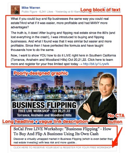
Mike Warren’s Facebook advertisement suffers from too much copy, an overwhelming visual, and no clear CTA.
These faults all make it one of the worst advertisements ever, in our opinion.
It’s basically a digital billboard.
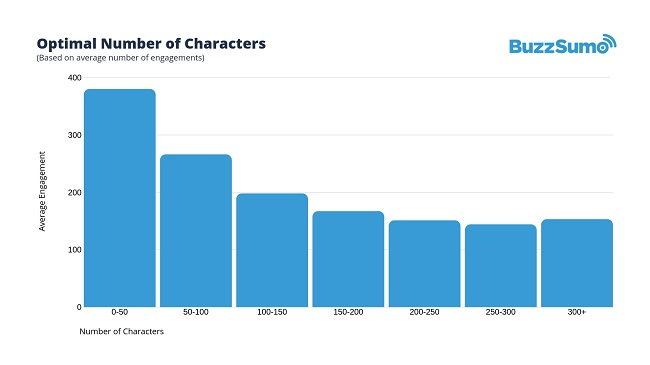
Consider that recent research has proven shorter posts are more effective.
The downfall of many of the cringiest Facebook posts is that they overdo their content to the point of being overwhelming.
Keep all of the content of your Facebook ads concise.
This will encourage people not only to read the whole thing, but also to click through and learn more or shop.
They’ll feel an urge to know more details because your Facebook ad left out enough to intrigue them.
Exhibit F: A Facebook Ad Example of Visuals Gone Awry
Any successful Facebook ad strategy incorporates a graphic (i.e. video, static image, carousel) that grabs the user’s attention.
Besides being eye-catching, the visual should also relate to the brand or promotion.
This probably isn’t news to you.
However, we’re emphasizing it because the image really is that important.
One of the worst things you can do is create a Facebook ad that has a blurry, indecipherable, or messed up image.
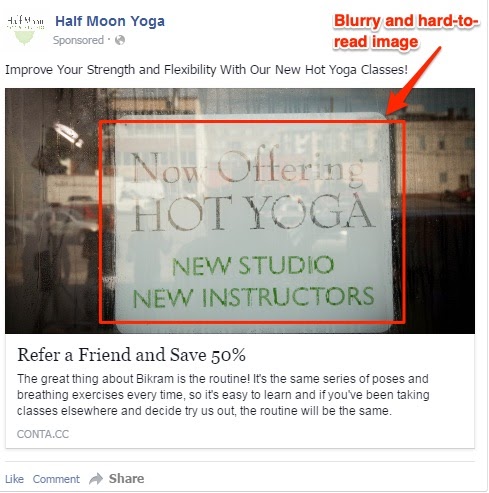
The ad above from Half Moon Yoga demonstrates what the worst ads of 2019 can look like from a visual standpoint.
The blurry image is difficult to read and fails to catch the viewer’s attention thanks to its transparent filter and lack of color.
Both of these qualities make the image itself entirely ineffective while taking attention away from the goal of the advertisement as a whole.
Don’t fall into the trap of a poorly-conceived ad image.
Instead, include a visual aid that supports the objective of your Facebook ad strategy.
Additionally, make sure it is a high-quality image devoid of too many additional details, like this rainy photo.
How the Worst Ads of 2019 Make Yours Better
Creating good ads is also about knowing what the worst ads on Facebook in 2019 look like.
Start by avoiding the mistakes made by the brands above and taking into account our suggestions for improving a Facebook ad strategy.
Do it right, and you might just find yourself on the list of the best Facebook ad examples of the year. On the other hand, you might need the help of a Facebook advertising agency to prevent your ads from being on our next edition of the worst Facebook ads.
