A responsive landing page is the centerpiece of a smart, mobile-first approach to any brand’s digital presence. In a world where thumbs do the talking and swipes lead the walk, a well-designed landing page can be the difference between a potential lead bouncing off or sticking around.
But how do you sidestep the common trip-ups that can tank most page’s performance?
In this article, we’ll explore 5 mistakes that companies make when building and optimizing landing pages. At the same time, we’ll also spotlight a shining example of a brand that’s hit the right notes while creating a landing page of their own.
Ready to ramp up your brand’s digital curb appeal? Let’s roll up our sleeves and make sure your responsive landing page packs a punch on any device.
What is a Responsive Landing Page?
A responsive landing page adapts effortlessly to any device. It ensures that every visitor enjoys a smooth, visually appealing experience whether they’re navigating on a smartphone, surfing on a tablet, or browsing through their desktop.
Landing pages that convert seamlessly adjust to the screen they’re viewed on, ensuring your message is crystal clear across all these devices. It’s about functional finesse as much as it is looking presentable.
By building a landing page that responds to various devices, you’re also signaling to search engines like Google that your site is designed with user experience in mind. This is crucial for SEO since Google will give higher search rankings to websites that best serve a user’s needs.
Remember that behind every swipe, tap, and click is a person – not just another user statistic. Whether your end game is to get someone to share, subscribe, or buy something from you, a well-designed responsive landing page will guide your visitors with a clear path towards deeper engagement.
Optimizing landing pages is about ensuring that path is as smooth and the story as compelling as possible – no matter the device. Get this right and your landing page will turn every visit into a step towards boosting your ROI.
How Do I Make My Landing Page Responsive?
Creating a landing page that’s responsive isn’t rocket science. It’s really about sticking to a few key principles to guarantee your page looks good on any device.
- Fluid Grids: Implement these so your layout expands or shrinks gracefully with the size of the screen it’s viewed on.
- Flexible Images: Use images that adapt without distortion – regardless of the viewing environment.
- Media Queries: Employ these clever bits of CSS magic to apply different styles depending on the device’s characteristics.
- Touchscreen Friendliness: Remember, many of your visitors will be tapping and swiping, not clicking. Make sure buttons and links are finger-friendly to avoid frustrating miss-taps.
- Speed Optimization: A responsive design isn’t just about looking good; it’s about loading quickly too. Optimize images and streamline code to keep loading times lightning-fast, even on mobile networks.
- Readable Text Without Zoom: Ensure that your text scales well so it remains legible on small screens. And doesn’t require users to pinch and zoom.
And here’s the clincher: testing. Don’t just give it a once-over on your desktop and call it a day. Test your landing page on various devices – phones, tablets, desktops – to catch any quirks.
By thoroughly testing on multiple devices, you’re creating a responsive landing page that doesn’t just look good in theory, but also works in the hands of your users.
5 Frequent Mistakes When Building a Responsive Landing Page
Building a responsive landing page is about providing a welcoming experience for every visitor, regardless of the device they use. But keep in mind that it’s a bit of a tightrope walk – lean too much in one direction, and you risk sending your mobile users tumbling.
1. Not Designing for Mobile Accessibility
People are on their phones constantly these days. In fact, 97% of all Americans now own a mobile phone, according to the Journal of Consumer Research. To make a landing page that isn’t mobile-friendly is a major misstep in today’s smartphone-centric world.
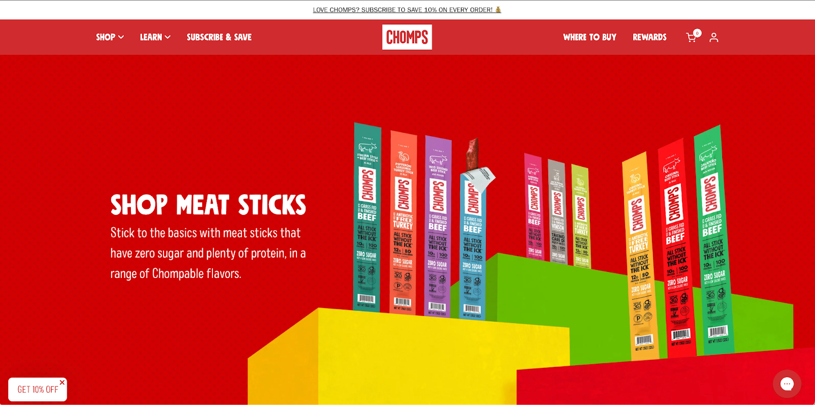
Consider Chomps. Their site and this responsive landing page, which showcases their meat stick snacks, aren’t just built for browsing on one kind of device.
It’s mobile-optimized. This ensures that users just need to tap and scroll through their snack selections. With clear, legible text and touch-friendly navigation, Chomps makes sure that your path to protein-packed snacks is clear and uncomplicated on any device.

2. Overloading the Page with Content
When it comes to optimizing landing pages, clarity is king. A page crammed with information is overwhelming — like walking into a room where everyone talks at once.
You need to streamline and cut any clutter out. Focus on what your audience is searching for and offer them additional value, too.
Chomps exemplifies this with their meat sticks landing page that’s super straightforward. The content right below the fold presents exactly what the visitor is looking to find: a tempting array of meat sticks, easy to browse and buy.
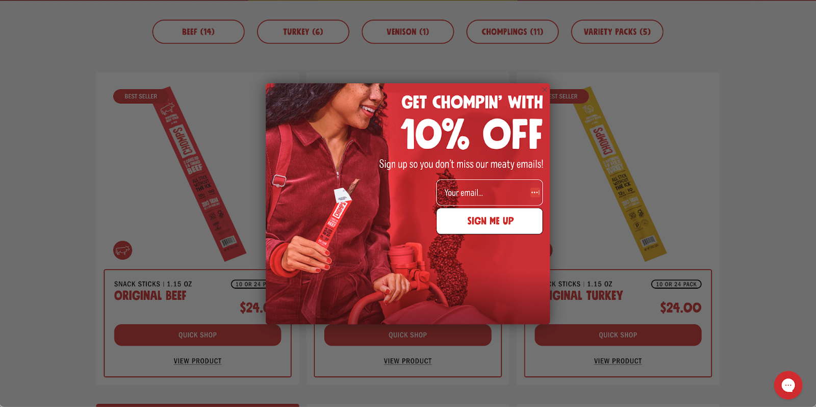
Plus, they entice you with a simple yet effective offer: sign up and save. No wasted space, just the good stuff front and center. This proves that when creating a landing page, sometimes less truly is more.

3. Forgetting to Include Social Proof
Imagine you’re at a crossroads: one sign is just a name while the other is surrounded by thumbs-up and five-star ratings. Which path would you trust?
If you chose the second option, we’re with you. That’s the power of social proof on a responsive landing page. In fact, a Trustpilot survey of nearly 1,700 consumers revealed that 66% of customers said that trust signals made them more likely to buy a product.
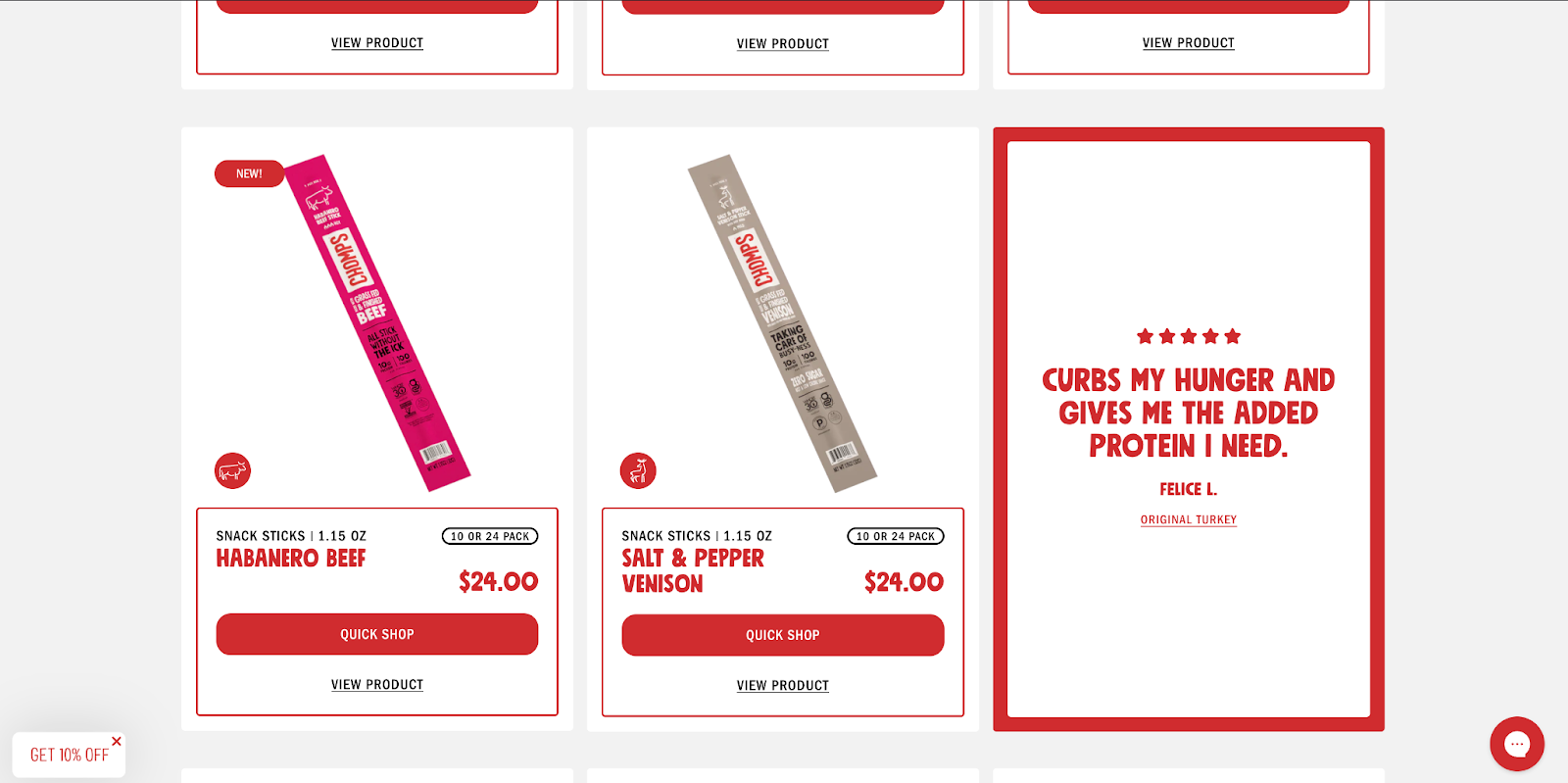
Going back to the responsive landing page that Chomps built, you’ll notice that it doesn’t only showcase products. It features glowing accolades from satisfied snackers, too.

These testimonials are simple, no-fluff statements. They serve as strategic signposts that give Chomp’s credibility, coaxing consumers further down the funnel of buying one of their delicious snacks.
4. Unclear Call-to-Action Buttons
In the universe of landing pages that convert, a clear call-to-action (CTA) is your North Star. It guides users swiftly to checkout, making the journey from curiosity to customer as straightforward as clicking that bolded button.
When you’re building a landing page, make your CTAs clear and engaging. Use straightforward language and position them where they’re easy to find. Remember that your page should serve as a map that leads visitors right where you want them to go.

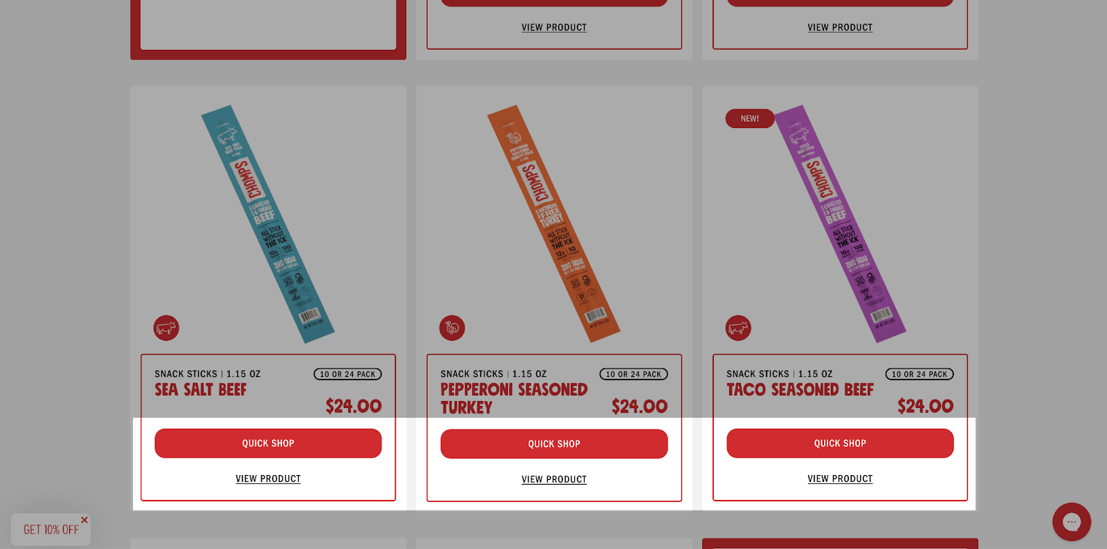
The ‘quick shop’ buttons on Chomps’ page for each of their products is an unmistakable invitation for visitors to go from browsing to buying without any detours.
5. Inadequate SEO and Content Optimization
Let’s talk about SEO and content. A responsive landing page without the right keywords results in costly missed opportunities. Wrong keywords attract the wrong kind of organic traffic that bounces rather than buys your products.
This is where having some smarts and know-how can help. At Taktical Digital, we helped Chomps with their SEO strategy, uncovering opportunities beyond “beef jerky”. We also matched and surpassed the content richness of their competitors, positioning Chomps’ responsive landing page to improve its position in search rankings.
Navigate to a Smarter Responsive Landing Page
Every user interaction, especially those on a responsive landing page, directly impacts your brand’s reputation. Steering clear of common design pitfalls is key in a digital landscape where first impressions are everything, more so if you’re advertising on LinkedIn and want high-quality leads.
Our team at Taktical understands that dodging common design missteps is just the beginning. We excel at creating engaging and responsive landing pages that lead to:
- Higher conversion rates
- More on-page engagement
- Longer session times
These metrics and more guide everything we do.
Want to learn more? Get in touch with us today.


