On both mobile and desktop platforms, Facebook is the social media behemoth with the biggest user base.
Having exceeded 1.23 billion daily active users as of December 2016 and growing, this massive audience represents a huge pool of consumers.
The potential to make millions by targeting even a tiny segment of Facebook users has attracted companies across every industry, as demonstrated in the platform’s ad revenue of $8.81 billion at the end of Q4, 2016.
Nearly every business wants a slice of the Facebook advertisement pie because it represents huge growth potential for them in terms of both ROI and brand awareness.
However, not every company succeeds in their campaign.
Just like with any other kind of marketing, Facebook ads can flourish or flop based on certain factors.
These range from visual appeal to placing the call to action (CTA) button in the right place.
Here, we’ve rounded up the best Facebook ads from last year that highlight the “do’s” of advertising on this social media.
The Ads
EE Shop
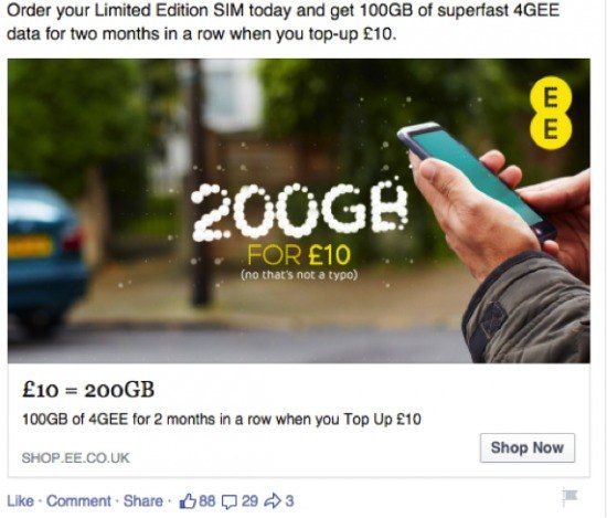
When it comes to successful advertising, a touch of humor is always a good strategy to employ.
In this ad, it brings a touch of humanity and relatability, while the high-definition image and customized typography draw the viewer in initially.
According to John Rampton, a leading Top 50 Online Influencer, “Start with an engaging headline that will draw people in but keep the body of your text simple, easy to read and straight to the point.”
This ad accomplishes just that with it’s clear offer and call to action button, which includes a conversion pixel to track clicks and website visitors.
Village Eatery
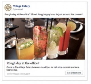
Facebook’s targeting tools are unrivaled in their ad campaigns.
This advertisement takes advantage of that with location tracking, ensuring this only appears to people within the geographic location selected (presumably near the establishment).
The tempting image and catchy copy are just the right elements to encourage viewers to take action.
The Digiterati
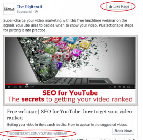
This ad demonstrates the wide range of capabilities within the Power Editor feature on the Facebook ad platform.
Not only has the company employed a vanity URL, but also has a customized CTA and an additional “Like Page” action button.
By incorporating as many options as possible for viewer engagement, this ad has a greater chance of success in terms of achieving its goal of website clicks.
Rue La La

The ability to expand advertising mediums beyond print is one of the greatest advantages in digital marketing.
Options like videos and carousel ads reach and relate to a wider audience, enhancing their effectiveness.
This ad from Rue La La accomplishes just that, with a captivating video and engaging description.
For ecommerce companies, especially, utilizing videos to show off products is a great way to entice consumers, and including a link to shop is just the right kind of call to action.
NatureBox
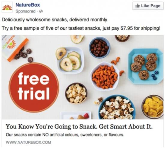
For an ad all about getting people to Like their company page, the keys to success are an engaging image, value proposition, and tempting descriptions.
With a relatable catchphrase as a headline, and emphasis on their ethos of all natural snacking, NatureBox does an excellent job of portraying their brand and attracting Likes.
The Look of Silence
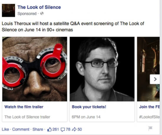
Carousel ads, like video ads, are a digital medium that can heighten a user’s experience and encourage them to action more effectively.
This advertisement makes the most of this template with high-quality, informative imagery.
Additionally, the utilization of unique calls to action below each image tailors the experience to the viewer, and provides more opportunities for conversion than just one CTA.
Paper
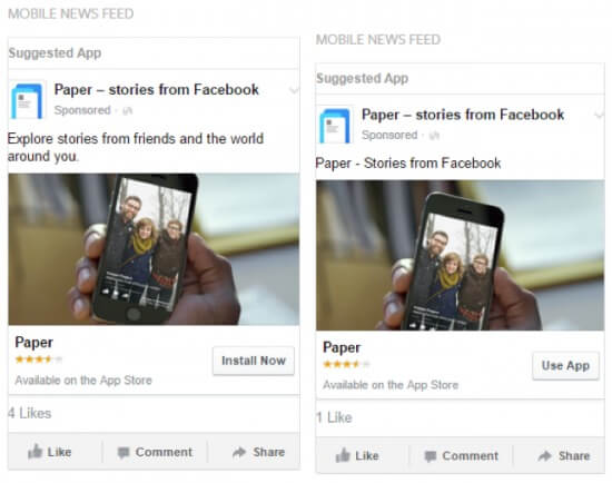
For Facebook ads aimed at encouraging app installs and downloads, the main features are a thumbnail photo, very brief text, and the call to action button.
Paper goes one step further in their ad to include a star rating system, which provides an extra layer of trustworthiness and adds value to the product.
As mentioned by Jerry Kelly, the Chief Marketing Officer and partner at Marketing 360®, in reference to effective design in Facebook ads, “If possible, show people using your product in your ad and focus your message on keeping it simple and consumer focused.”
For an app-related ad, this advice is especially crucial, and Paper demonstrates how to follow it effectively.
Jasper’s Market
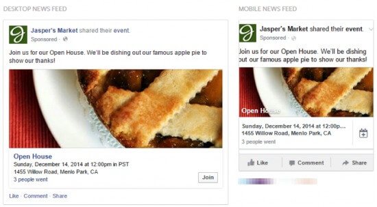
This ad focuses on marketing an upcoming event and employs a tantalizing, but still relevant, image and an inclusive description to encourage RSVPs.
The use of “us” and “our” lets viewers feel like they are a part of the company, while the enticement of delicious food is added incentive.
123-reg
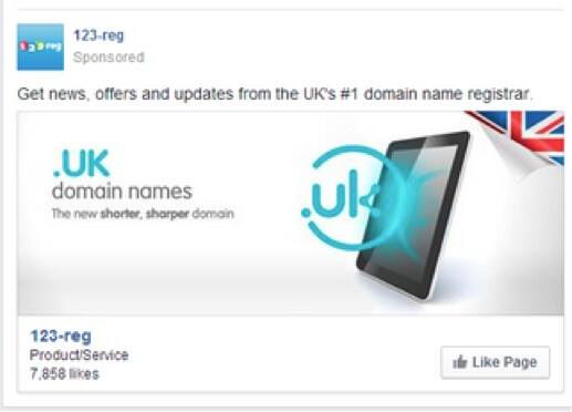
Like NatureBox, this ad is aimed at achieving Page Likes.
Also like NatureBox, it succeeds in this endeavor with a stylish image and clear, value-add language in its description.
123-red addresses they “why” on every consumer’s mind (Why should I Like your page?) with a concise description that both explains and entices.


